

Find Your Painting Style in 30 Days
Developing a recognisable painting style that people associate specifically with you as an artist can feel out of reach. The questions I am asked most by learners my workshops is… “how can I find my style?”.
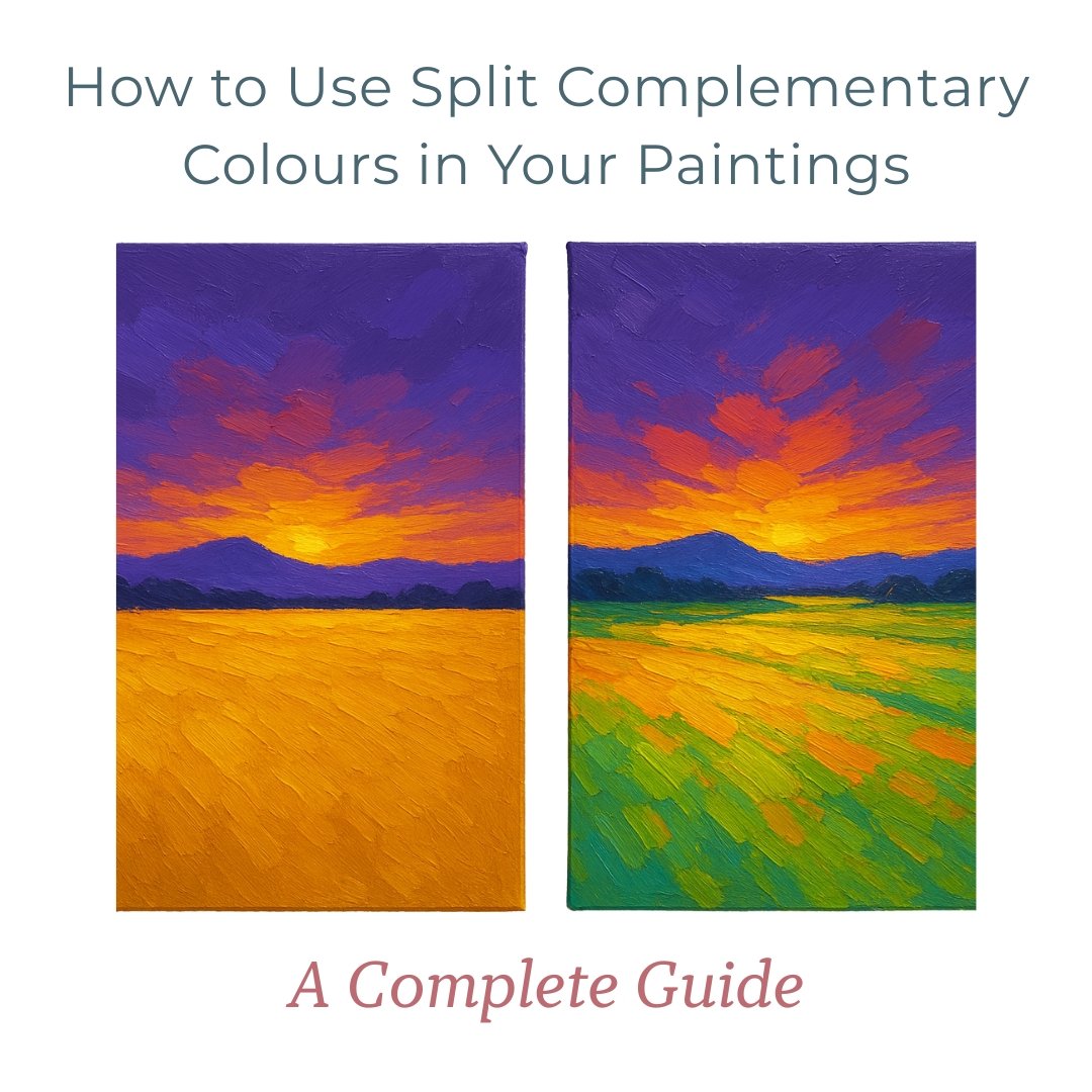
How to Use Split Complementary Colours in Your Paintings: A Complete Guide
Understanding colour theory can transform your paintings from good to beautiful. One technique that consistently delivers beautiful results is using split complementary colours. This colour scheme brings instant vibrancy to your artwork while giving you more creative flexibility and visual balance. In this guide, we'll explore what split complementary colours are, how to use them effectively in your paintings, and why they're such a game-changer for artists at any level.

What If You Only Need 3 Colours For Every Painting?
The secret to more harmonious, confident paintings might be simpler than you think - it's all about understanding your "Colour Corners." You don’t need to buy every single colour tube displayed in the art shop, your box of paints doesn’t need to resemble an overflowing treasure chest from Davy Jones’ Locker and you don’t need to end up with a ‘muddy’ looking painting because of a chaotic palette. What if you only need 3 colours?

How to Fix a Flat Painting: Simple Ways to Add Dimension
My painting is flat, how do I get some dimension? Creating dimension isn't about complex techniques or fancy materials. It starts with something as simple as taking a step back. In fact, one of our most powerful studio secrets begins with putting your brush down! Read my guide for the exact techniques that have helped hundreds of our students and will help you transform your paintings from flat to fabulous.