
How to Use Split Complementary Colours in Your Paintings: A Complete Guide
Understanding colour theory can transform your paintings from good to beautiful. One technique that consistently delivers beautiful results is using split complementary colours. This colour scheme brings instant vibrancy to your artwork while giving you more creative flexibility and visual balance. In this guide, we'll explore what split complementary colours are, how to use them effectively in your paintings, and why they're such a game-changer for artists at any level.
What Are Split Complementary Colours?
Split complementary colours build on the classic complementary colour approach you might already know. With regular complementary colours, you simply pick two colours that sit directly across from each other on the colour wheel - like purple and yellow.
Split complementary colours work a bit differently though: instead of using that direct opposite colour, you pick the two colours sitting on either side of it.
Let's say you're working with purple as your main colour. Normally, you'd pair it with yellow (its direct complement). With the split complementary approach, you'd choose yellow-orange and yellow-green instead - the colours flanking yellow on the wheel.
Why does this work so well? You still get that eye-catching contrast that makes complementary colours so effective, but with added richness and visual interest. It's like getting the best of both worlds, colours that pop but don't fight each other.


How to Use Split Complementary Colours
1. Choose Your Base Colour: Start by selecting a dominant colour for your painting. This will be the foundation of your palette.
2. Identify the Complementary Colour: Find the complementary colour on the colour wheel. This will be the opposite hue to your base colour.
3. Select the Split Complements: Choose the two that are adjacent to the complementary colour. This trio will form the basis of your painting.
4. Experiment with Proportions: Use the three colours in different amounts allowing each colour to be the dominant one until you feel a sense of balance.
5. Create Focal Points: Use your choices to draw attention to specific areas of your painting. For example, if your base colour is yellow-green, you might use the purple and yellow-orange to highlight certain features, creating a focal point that captures the viewer's eye. Here is an example by Helen Frankenthaler…

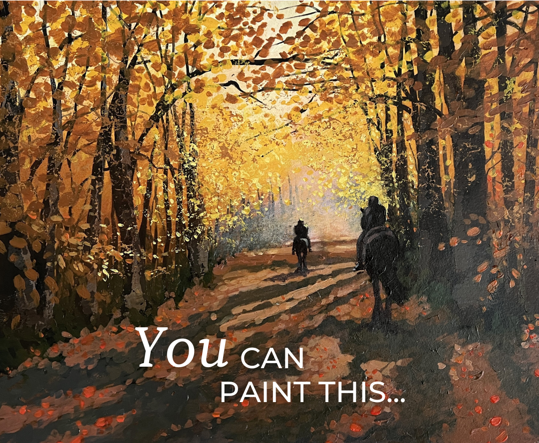
This painting by Tony Allain utilises purple as the main colour with some yellow-green and as well as accents of yellow-orange which make the painting sing along with some neutrals.

When you start using split complementary colours in your paintings, you'll notice your colour choices become much more intentional and cohesive. This technique helps you create artwork that's both vibrant and visually balanced, something that can be trickier to achieve with other colour approaches.
One of the best things about split complementary colours is how they make it easy for you to try new combinations.
No matter where you are in your painting journey, split complementary colours can open up new creative doors. You'll be amazed at the colour combinations you stumble upon and how they completely change the feel of your paintings.
Ready to give it a try? Grab your colour wheel, pick out some split complementary paint colours, and see where this technique takes your next painting. You might just create something that surprises you!
Different Ways You Can Learn With Me

Learn to Paint at Home in 7 Steps with Professional Guidance
My collection of online painting tutorials help you to learn to paint in both acrylics and oils from the comfort of your own home.
The video lessons give you access to the same step-by-step demonstrations and supportive teaching style my studio students experience. I guide you through each stage clearly and at your own pace.
If you're a complete beginner picking up a paintbrush for the first time or looking to develop your painting skills, these paint-along videos are designed to build your confidence.
Starting from just £15 one off payment per lesson.

Weekly Workshops held in Norfolk, UK
Join me for a special weekly painting experience where you'll grow as an artist alongside like-minded friends who share your passion for painting.
Learn to paint in acrylics and oils as I demonstrate the skills and techniques that will help you to feel more confident in your own artwork.
The Members Studio is suitable for those with a little painting experience. To become a member simply choose a workshop that you would like to attend and book yourself a space.

A Thursday Evening Painting Course for Beginners in Norfolk, UK
This course is perfect if you're completely new to painting or if you've tried before but felt a bit overwhelmed.
We're going back to basics in a light-hearted and supportive environment. Think step-by-step guidance, friendly faces and the kind of atmosphere where you can ask anything without feeling daft.
One evening per week, Thursdays, from 6 - 8pm.
Next Start date is Thursday 23rd April
Get free art advice and improve your painting every month with my newsletter below.